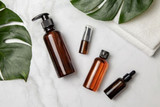
Commercial Packaging Design: 3 Common Pitfalls That You Must Avoid

What’s the first drink that comes to your mind when you hear the words ‘fizzy drink’ and ‘red’? If it’s Coke, give yourself 10 points!
If one removes the logo of Nutella and shows you the empty jar, would you still be able to recognize the brand? We are sure you can!
Both these brands have highly distinctive packaging that not only makes them more recognizable but also adds to the recall value of the product. In a world full of chocolate boxes, Toblerone stands tall and proud with its unique and iconic triangular box. In short, packaging can make and break a product.
You could be in the same league as the rest of these brands—only if you pay attention to your product’s packaging and avoid these mistakes:
Not considering the target audience
Before you finalize a packaging design, make sure you understand the target audience well. If you’re selling chocolate spread for kids, you don’t need to draw too many visuals and health charts. It’ll confuse them into thinking that the spread is a medicinal product that might not be for them. You should be aware of what the customer expects and the final design should be aligned accordingly. A customer looking to buy a beauty product for acne won’t buy it if you’ve overcomplicated the design with too many flowers and decorations—they’ll make the product look childish.
If it’s a medicinal product, keep the design sophisticated, simple, and sober—avoid using bright colors. If it’s a beauty product, you have a greater margin to play around with colors and make the packaging look vibrant. If it’s for an energy drink, you can use designs that are rugged, outdoorsy, and powerful.

Outdated designs
For starters, you need to understand that ‘vintage’ is not the same as being plain, old, and boring.
Back in the days, body lotions came in plain cylindrical bottles with simple design elements. Doing the same today won’t make much sense. Modern customers want products with packaging that’s functional and visually appealing. In case of a body lotion, they want something that looks good on their dresser or looks aesthetically pleasing, every time they take it out of their bag in public.
Innovation is the key—it adds to consumer appeal. To keep up with the competition, you need to keep up with trending ideas as well. Browse through Pinterest to see modern consumers like. Make the design interactive in a way that it talks to the consumer. Add the ‘cool’ factor to make them stand out on the shelf.
No white space
The colors that you add should be carefully chosen and not overdone. Just because you’re selling herb-based natural skincare, doesn’t mean an all-green design would work. Leave some white space so the colored elements can be highlighted. This not only helps you focus on the brand message better but also keeps the design simple and straightforward. Adding plenty of white space also keeps you from overcomplicating things and overdoing the design.
After you’ve chosen the right design, make sure you choose the right wholesale glass bottle seller to have the bottles made. Premium Vials offers high-quality tin containers, metal containers, vials, jars, and flasks. Get in touch now to learn more about our products.
Recent Posts
-
Great ideas need Great packaging.
Whether you’re looking for bulk glass or plastic containers, jars or closures, We’ve got you co …4th Nov 2024 -
Why Should You Choose Amber Glass When Packaging Beauty Products?
Designing a line of beauty products is no simple task. So many details go into planning and crafting …7th Jul 2022 -
Candle Supplies - The Benefits of Using Tins for Your Candle Business
Candle business is a fantastic way to turn a hobby into an extra income stream. For those willing an …7th Jul 2022


